Realtime data plot
Following on from my earlier smoothiecharts trying to use smoothiecharts with flask-socketio for realtime data i managed to get an alternative working this time using charts https://www.chartjs.org/ Using this i am now able to generate random data (in lieu of external input values) and have them graphed in realtime on a line chart created using the api. The main part of the flask-python element consists of the data creation routine
@application.route('/')
def index():
    return render_template('data_acq.html')

@application.route('/chart-data')
def chart_data():
    def generate_random_data():
        while True:
            timestamp = datetime.now().strftime('%H:%M:%S')
            tc1 = round(random.random() * 100)

            json_data = json.dumps(
                {'time': timestamp, 'value0': tc1})
            yield f"data:{json_data}\n\n"
            values = (timestamp,tc1)
            header = ['timestamp','tc1']
            time.sleep(1)
            print(values)

    return Response(generate_random_data(), mimetype='text/event-stream')
and then inside the appropriate html file we have'
- the link to the charting library
<head>
    <meta charset="UTF-8">
    <title>realtime chart demo</title>
    <link href="https://cdnjs.cloudflare.com/ajax/libs/twitter-bootstrap/4.3.1/css/bootstrap.min.css" rel="stylesheet">
    <link href="https://cdnjs.cloudflare.com/ajax/libs/Chart.js/2.8.0/Chart.min.css" rel="stylesheet">
</head>
- then the body contains the div element for the line chart
<div class="container">
    <div class="row">
        <div class="col-12">
            <div class="card">
                <div class="card-body">
                    <canvas id="canvas"></canvas>
                </div>
            </div>
        </div>
    </div>
</div>
- and the javascript to receive the data from the flask app
<script src="https://cdnjs.cloudflare.com/ajax/libs/jquery/3.4.0/jquery.min.js"></script>
<!--suppress JSUnresolvedLibraryURL -->
<script src="https://cdnjs.cloudflare.com/ajax/libs/twitter-bootstrap/4.3.1/js/bootstrap.min.js"></script>
<!--suppress JSUnresolvedLibraryURL -->
<script src="https://cdnjs.cloudflare.com/ajax/libs/Chart.js/2.8.0/Chart.min.js"></script>

<script>
    $(document).ready(function () {
        const config = {
            type: 'line',
            data: {
                labels: [],
                datasets: [{
                    label: "TC1",
                    backgroundColor: 'rgb(255, 179, 179)',
                    borderColor: 'rgb(255, 179, 179)',
                    data: [],
                    fill: false,
                }
],
            },
            options: {
                responsive: true,
                title: {
                    display: true,
                    text: 'Random value'
                },
                tooltips: {
                    mode: 'index',
                    intersect: false,
                },
                hover: {
                    mode: 'nearest',
                    intersect: true
                },
                scales: {
                    xAxes: [{
                        display: true,
                        scaleLabel: {
                            display: true,
                            labelString: 'Time'
                        }
                    }],
                    yAxes: [{
                        display: true,
                        ticks: {
                        suggestedMin: 50,
                        suggestedMax: 200},
                        scaleLabel: {
                            display: true,
                            labelString: 'Value'
                        }
                    }]
                }
            }
        };


        const context = document.getElementById('canvas').getContext('2d');

        const lineChart = new Chart(context, config);

        const source = new EventSource("/chart-data");

        source.onmessage = function (event) {
            const data = JSON.parse(event.data);
            if (config.data.labels.length === 100) {
                config.data.labels.shift();
                config.data.datasets[0].data.shift();
            }
            document.getElementById('time').innerHTML = data.time;
            document.getElementById('tc1').innerHTML = data.value0;
            config.data.labels.push(data.time);
            config.data.datasets[0].data.push(data.value0);
            lineChart.update();
        }
    });
</script>
Adding all this together results in a line graph that is updated every second looking like
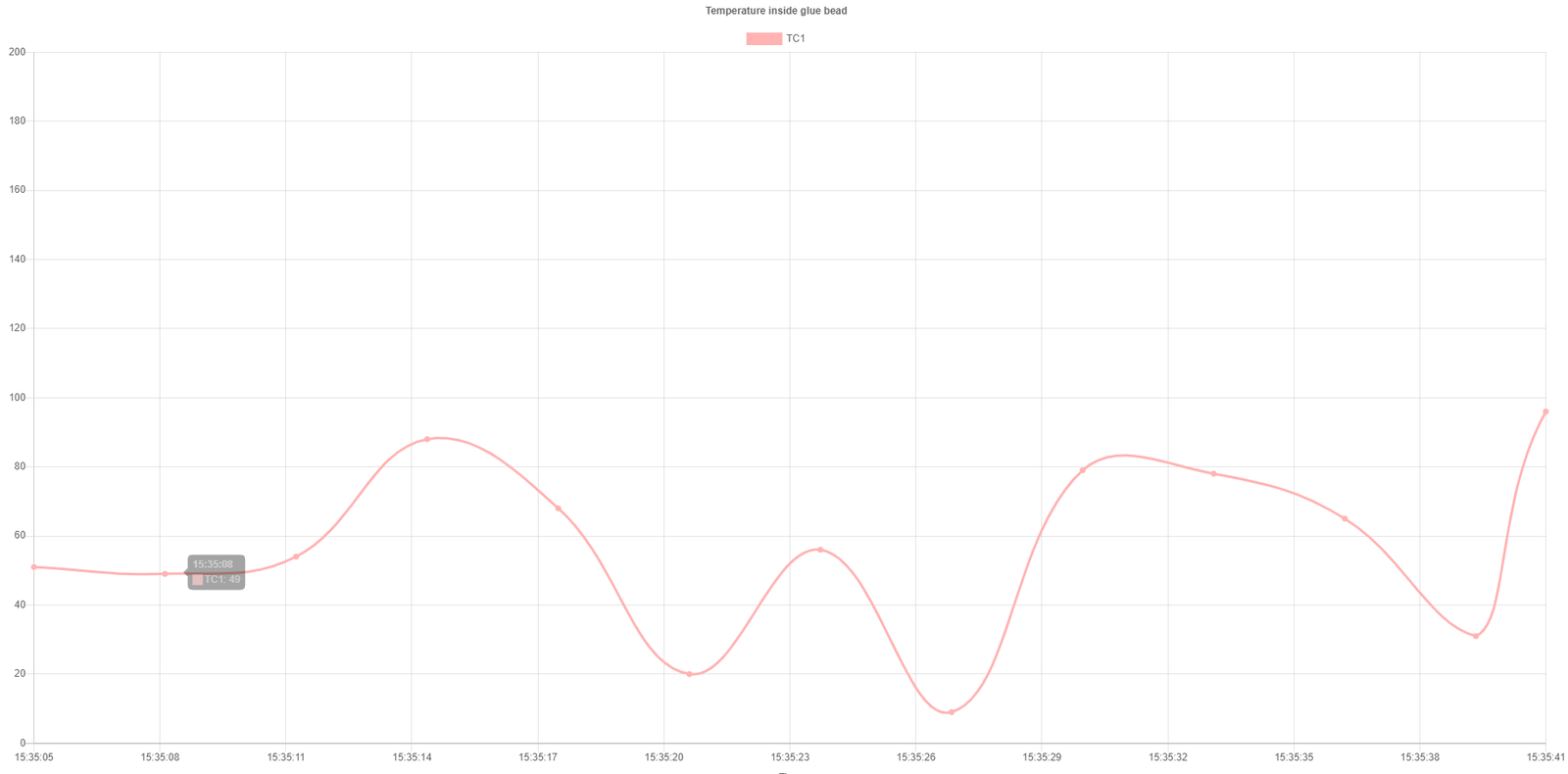
with a simple table underneath that also shows the last value received. Currently it shows 100 values on the chart before each one is "lost" like a FIFO system but we can change this by altering the value in the HTML file
if (config.data.labels.length === 100) {
    config.data.labels.shift();
    config.data.datasets[0].data.shift();
}
So changing the value seen above dictates how many values are plotted on the chart before being moved off it, following the above it should easily be possible for anyone to build a chart with multiple realtime values shown.